
Posters as Art
The majority of movie posters are easily forgotten. They use formulas, rely on floating heads, and make desperate cries for attention. However, some posters are aware of restraint. They are aware that an explosion can never convey as much as a single color, a clever visual trick, or even just plain space. These ten posters stuck with me because they were smart, not because they were noisy.
HM: Antman
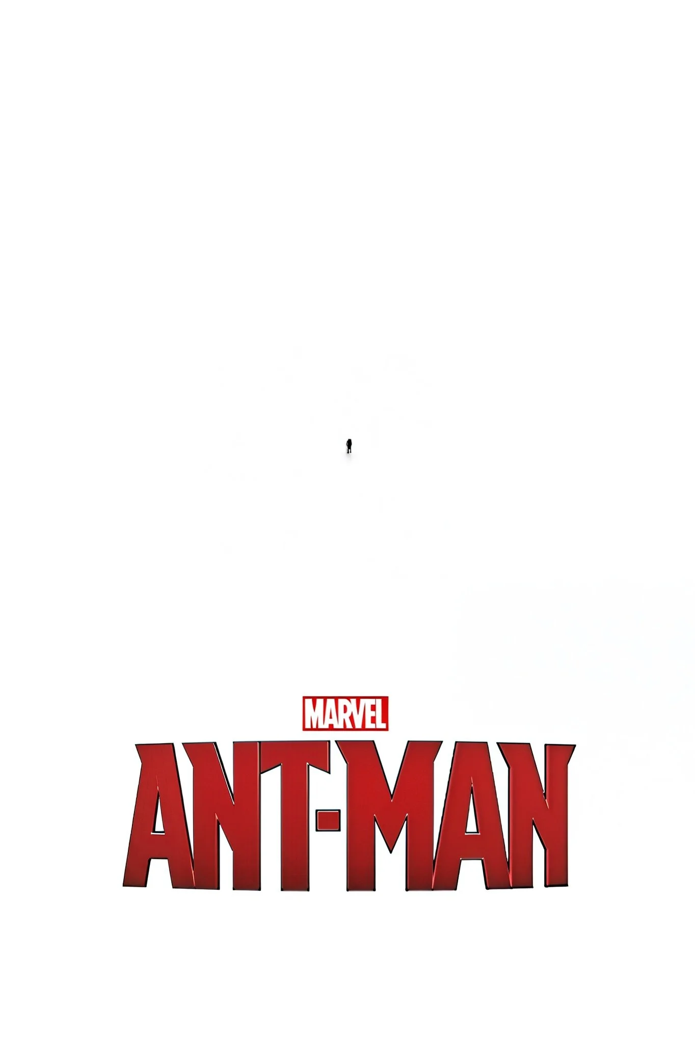
Such a clever poster. I prefer these types of posters far more than floating head posters.
10. Kill Bill
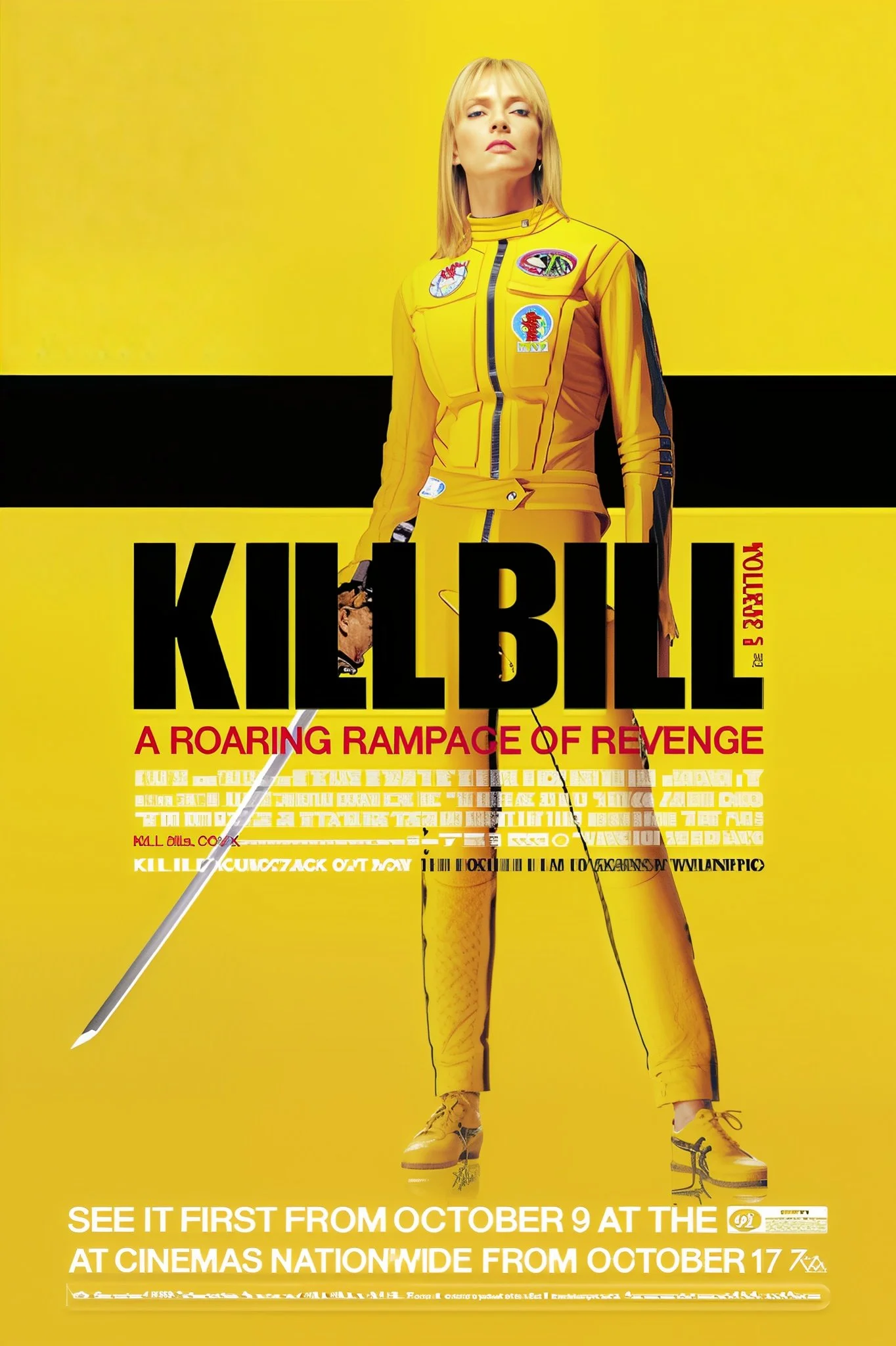
Bright backgrounds contrasted with that yellow jumpsuit. Comic book blocking and high contrast. Tarantino created his own version of Bruce Lee's Game of Death costume. Less is more, the poster believes. Black or white with yellow. No sword, no blood, and occasionally no text. All the work is done by her silhouette alone. An entire aesthetic is condensed into a single image: violence as art, retaliation as fashion. You already know when you see yellow.
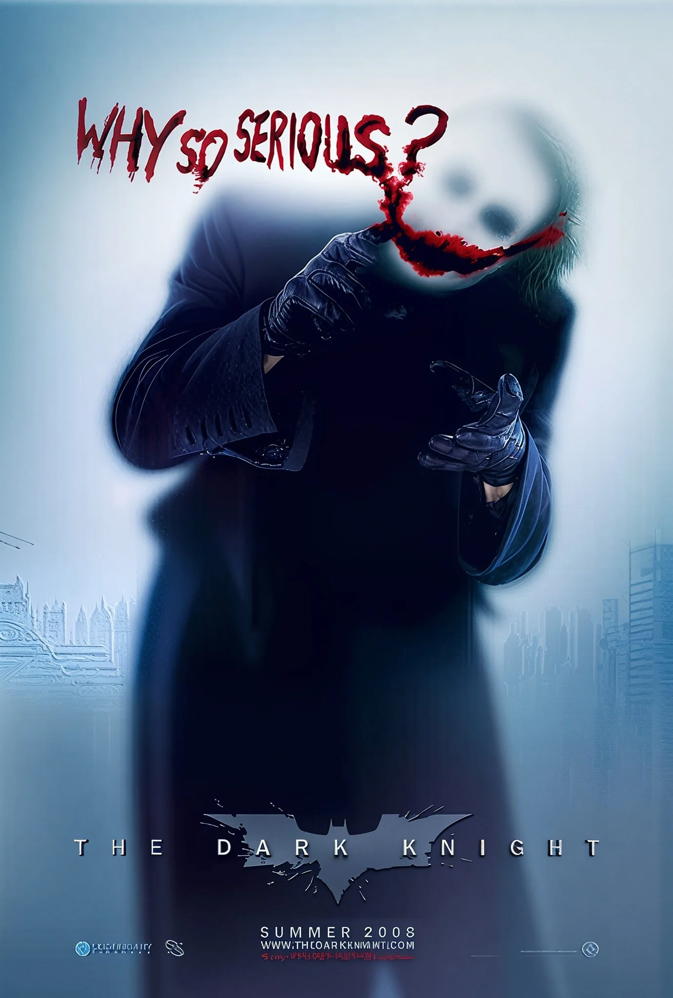
9. The Dark Knight
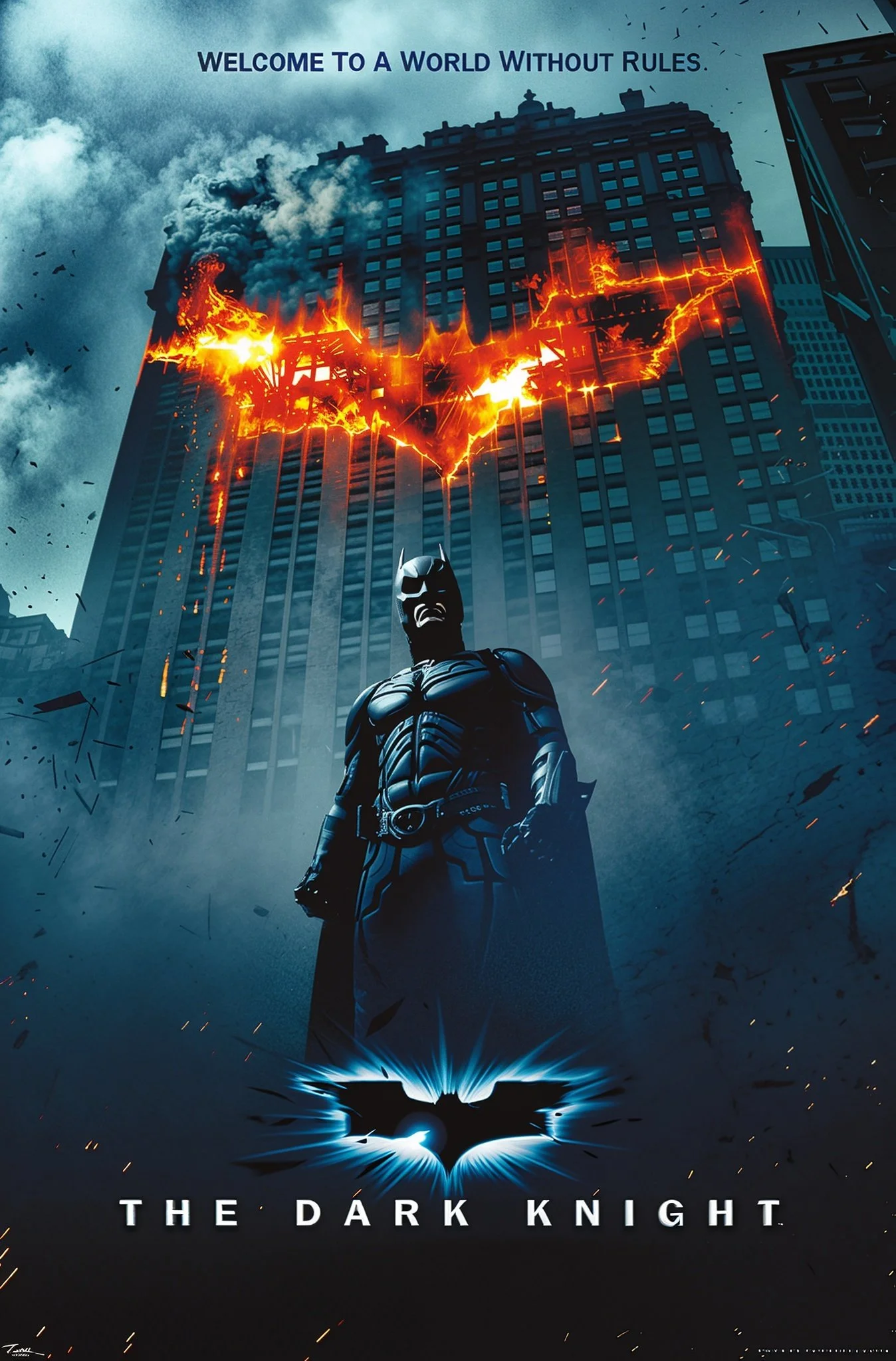
Main: Gotham on fire reflected in the logo. Disorder as structure. The bat symbol a gateway to devastation, order embracing its counterpart. It's Nolan's entire thesis in graphical form: the wafer thin difference between heroism and catastrophe
Joker "Why so serious?": Face smeared across white space. Unhinged minimalism. Most villain posters try to show their villain as tough, menacing in traditional ways. This one shows the Joker battered, almost vulnerable, and so all the more terrifying. The white space refuses comfort or context. Just him, just that question, just the menace of violence
8. Logan
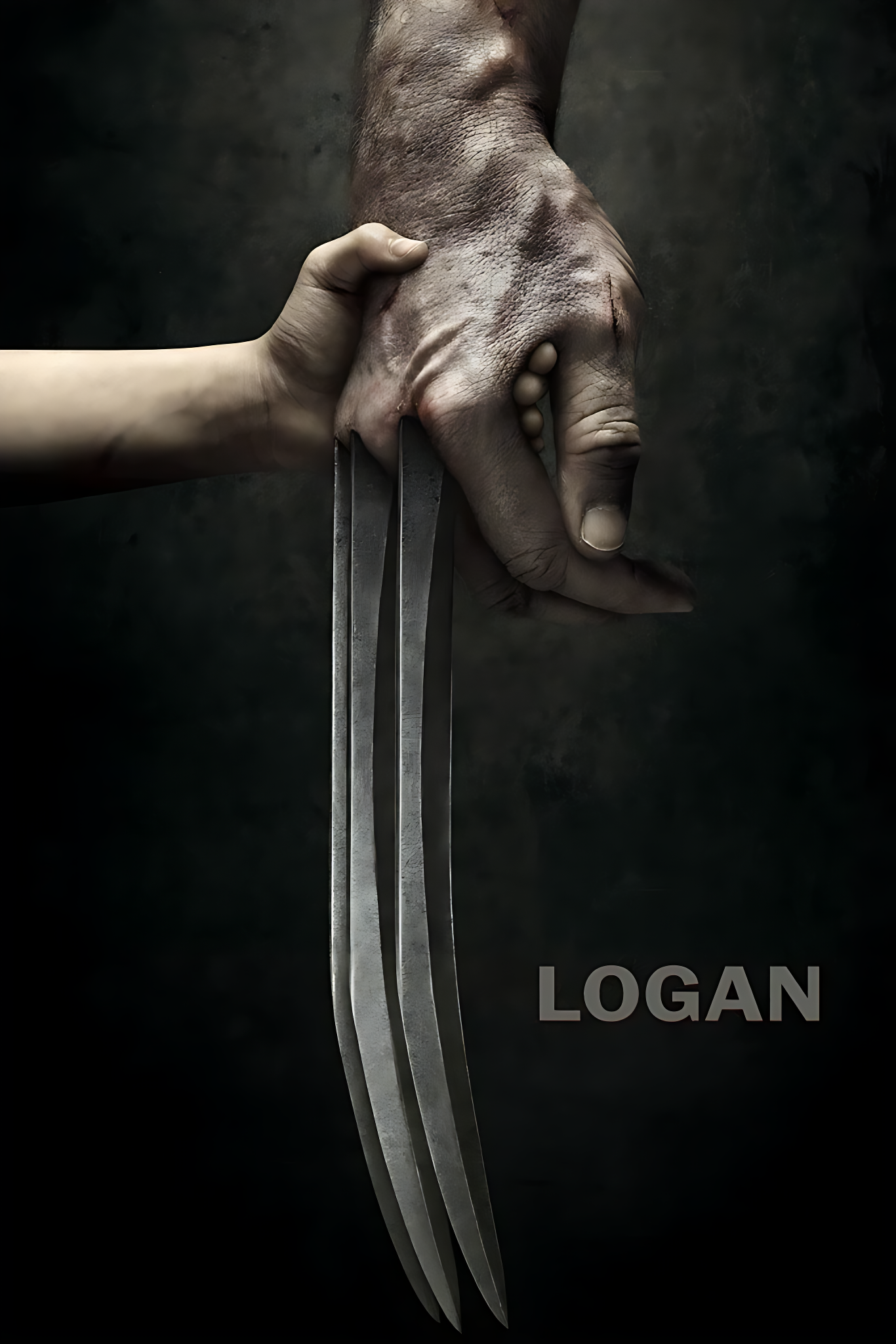

Both of these are very minimalist posters, while also being polar opposites to each other. The first shows Logan’s dying claw being grasped by X23, while the latter shows Logan alone. Juxtaposing just these two posters together, you almost get a sense of Logan’s full character arc during this movie. You can see the rage within Logan in the second poster, with the beautiful sunset in the backdrop of a desert landscape, while in the second shows Logan’s hand with a very loose grip rather than a tight/fist one, showing where his character is.
7. Back to the Future


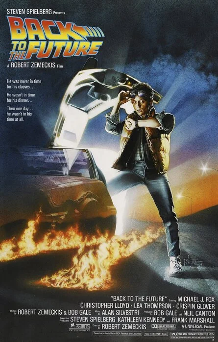
I dont really know what I love so much about these posters. I think overall, I just love the blue & orange or sort of ethereal look of 70s and 80s posters. The fact that all of the posters are linked up with Marty being in the same position is such an awesome detail, with the clothes he is wearing showing what time period he will be in. The Back to the Future logo is also just so iconic and really makes this poster what it is. Also the use of “II” or “III” rather than “2” or “3” is something I really appreciate in movie titles.
6. The Batman


The silhouette and the red lighting are effective. It's gothic without being cartoonish. Reeves realized that Batman is most effective when he is almost invisible and more shadow than man. The red feels more like danger, like something leaking into the frame, than a action-movie type of red. The “To The Batman” one is just absolutely horrifying and so epic.
5. Blade Runner


Probably the only “Floating Head” type of poster that I like. I think that is mostly due to the fact that that design really fits the aesthetic of the movie. In the first poster, it is so cool that they include little Japanese symbols around the characters, and the use of lighting is amazing. The second poster is again a very simple, even somewhat generic poster, but the use of pastels to depict that characters are amazing, especially with the smudgy sort of figures that the pastels help convey showing the ambiguous, almost philosophical nature of the movie. If you want to read my full dissection of this movie, click this link.
4. True Detective

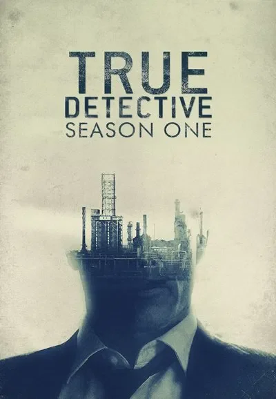
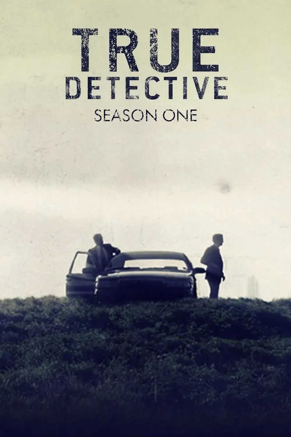
These posters are so cohesive with eachother but also the vibe of the show. I love how they make Marty and Rust’s face sort of translucent with the industrial, ghost-town vibes in True Detective Season One, especially in the Intro of the show. As you can tell, I’m a big fan of simple posters but lots of detail at the same time, and I think they did this perfectly. I think it’s so cool how the “True Detective” text in the second and third poster are overlayed with a rustic (get it) sort of texture, which is perfectly representing the gritty nature of the setting. All of them also use desaturation to a tee in order to convey the tone of the show.
3. Silence of the Lambs

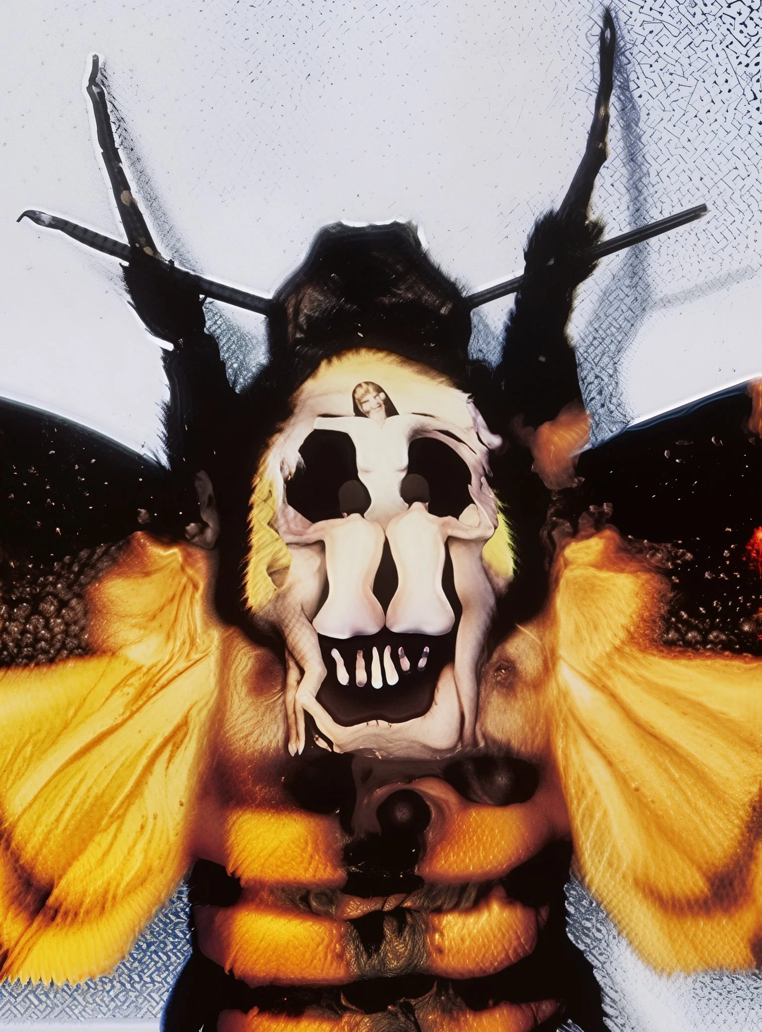
I actually did not learn about the secret detail in this poster until I was researching for this; The skull on the butterfly is actually Salvador Dali’s “In Voluptas Mors.” That adds another layer of disturbing detail to this movie which is such an insanely clever detail. It is quite a simple poster at first glance, but I love everything about it. Everything down to the fonts that they use at the bottom, to how they separate the actors names by a “/”, and also how all of Jodie Foster’s face is white besides her eyes. If I was going into the theater on Valentine’s Day 1991, I would be terrified.
2. Pulp Fiction
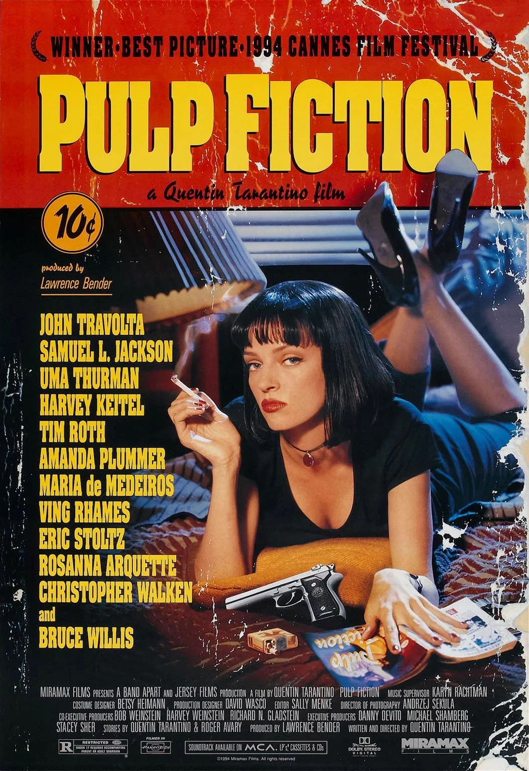
Two Uma Thurman posters on here. There isn’t anything particularly mind boggling about this poster, but I think it perfectly encapsulates the vibe of this movie. The 10¢ logo, the text font and all the actors listed, the sort of vintage looking border on the outside just gives it such a badass look. One of the most iconic posters ever for a reason.
1.Star Wars (General)


The Phantom Menace: Anakin's shadow forming Vader is one of the smartest uses of negative space and foreshadowing in poster history
Revenge of the Jedi: "Revenge" vs. "Return" alters the film's entire emotional register, and the rarity also adds mystique.
Empire Strikes Back B style: more sinister composition, darker color scheme. Before you even purchased a ticket, it indicated a change in tone.
A New Hope original: Luke and Leia are framed like Renaissance characters by that gold border. Although it promised adventure, it felt epic rather than campy. Best poster in film history.
This was more of a “fun” post for me to make, and I hope to do stuff like this more often. I’m hoping to share a top 10 movie list, as well as movies that are on my priority watch list. I left this post with an even deeper appreciation for the art of poster-making and I hope you do as well. Thank you for reading!